An illustrative example – beer!
Let’s run a cluster analysis on a new dataset outlining different beers with different characteristics. We know that there are many types of beer, but I wonder if we could possibly group beers into different categories based on different quantitative features.
Let’s try! Let’s import a dataset of just a few types of beer and visualize a few rows in Figure 11.17:
# import the beer dataset url = ‘../data/beer.txt’
beer = pd.read_csv(url, sep=’ ‘)
beer.head()
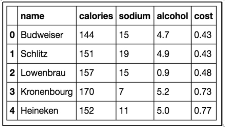
Figure 11.17 – The first five rows of our beer dataset
Our dataset has 20 beers with 5 columns: name, calories, sodium, alcohol, and cost. In clustering (as with almost all ML models), we like quantitative features, so we will ignore the name of the beer in our clustering:
# define X
X = beer.drop(‘name’, axis=1)
Now, we will perform k-means clustering using scikit-learn:
# K-means with 3 clusters
from sklearn.cluster import KMeans
km = KMeans(n_clusters=3, random_state=1) km.fit(X)
Our k-means algorithm has run the algorithm on our data points and come up with three clusters:
# save the cluster labels and sort by cluster beer[‘cluster’] = km.labels_
We can take a look at the center of each cluster by using groupby and mean statements (visualized in Figure 11.18):
# calculate the mean of each feature for each cluster beer.groupby(‘cluster’).mean()
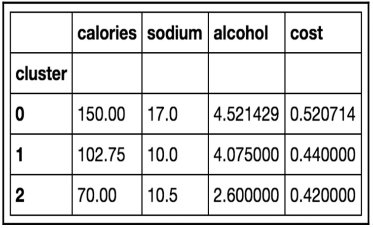
Figure 11.18 – Our found clusters for the beer dataset with k=3
On inspection, we can see that cluster 0 has, on average, a higher calorie, sodium, and alcohol content and costs more. These might be considered heavier beers. Cluster 2 has on average a very low alcohol content and very few calories. These are probably light beers. Cluster 1 is somewhere in the middle.
Let’s use Python to make a graph to see this in more detail, as seen in Figure 11.19:
import matplotlib.pyplot as plt
%matplotlib inline
# save the DataFrame of cluster centers centers = beer.groupby(‘cluster’).mean() # create a “colors” array for plotting
colors = np.array([‘red’, ‘green’, ‘blue’, ‘yellow’])
# scatter plot of calories versus alcohol, colored by cluster (0=red, 1=green, 2=blue)
plt.scatter(beer.calories, beer.alcohol, c=colors[list(beer.cluster)], s=50)
# cluster centers, marked by “+”
plt.scatter(centers.calories, centers.alcohol, linewidths=3, marker=’+’, s=300, c=’black’)
# add labels plt.x
label(‘calories’) plt.ylabel(‘alcohol’)
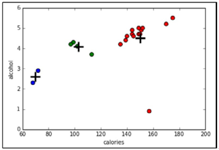
Figure 11.19 – Our cluster analysis visualized using two dimensions of our dataset
Choosing an optimal number for K and cluster validation
A big part of k-means clustering is knowing the optimal number of clusters. If we knew this number ahead of time, then that might defeat the purpose of even using UL. So, we need a way to evaluate the output of our cluster analysis. The problem here is that, because we are not performing any kind of prediction, we cannot gauge how right the algorithm is at predictions. Metrics such as accuracy and RMSE go right out of the window. Luckily, we do have a pretty useful metric to help optimize our cluster analyses, called the Silhouette Coefficient.